5 Essential Advanced Tailwind Tips
- html
- tailwind
- tutorials
Tailwind is something else when compared to the traditional CSS. Tailwind has gained a lot of popularity. Because of its utility-first approach, it is easy and intuitive to get started with. I feel like the main benefit is not having to juggle between separate CSS files speeding up the development process.
However, I am not saying that Tailwind is the CSS killer. It may become hard to maintain Tailwind on a larger project, especially when using multiple pseudo-classes for styling. However, Tailwind is adapted by many large-scale companies, making the utility-classes possible to maintain, like any other code base.
This is not a tutorial on how to set up Tailwind. Nor will I cover how to center a div. I’ll showcase five Tailwind techniques which helped me on my dev journey and I’ve found out to be the most helpful.
The code snippets provided as examples omit a lot of Tailwind classes to save reading and therefore copy pasting the provided code snippets might not cause the same output. Code examples are there just to show, not to provide production ready code.
Customize the Theme
Let’s say that you have your website designed in Figma or whatever. The design includes colors, fonts, etc. Now you translate this design into the website using Tailwind. However, you must remember the color values and everything else every time you want to reuse them. Coming back and changing the colors later would be a pain.
Thankfully Tailwind lets to define your custom color palette, fonts, type scale, border sizes, breakpoints — anything related to the visual design of your site.
Open your tailwind.config.js, it’ll look something like this:
/** @type {import('tailwindcss').Config} */
export default {
  content: [],
  theme: {
    extend: {},
  },
  plugins: [],
}
The theme object inside defines the values that are available to be used in the utility-classes. You do not want to overwrite the existing core theme of Tailwind and that is why Tailwind lets you extend the default theme with theme.extend.
You could also create your own theme by defining the values outside of the extend object. Tailwind lets you customize a lot of stuff. For further reading and a complete list of configuration options, check out the theme configuration docs.
How to Define and Use Custom Colors in Tailwind
Adding custom colors into the Tailwind theme is a breeze. Let’s imagine the designers have defined three colors using the 60:30:10 color rule; primary: #FAF9F5, secondary: #F2EFEA, and accent: #3E3E41.
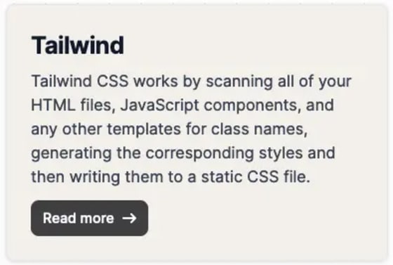
You were tasked with building a card with a link button. The background color of the card must be in the primary color and the color of the link button must be in the accent color.

Now you define the colors inside the utility functions like a good Tailwind developer would. All Gucci, right?
<div className="… bg-[#F2EFEA] …">
  <h2 className=" … ">Tailwind</h2>
  <p className=" … ">
    Tailwind CSS works by scanning all of your HTML files, JavaScript components,
    and any other templates for class names, generating the corresponding styles
    and then writing them to a static CSS file.
  </p>
  <a href="#" className="… bg-[#3E3E41] …">
    Read more
    <svg>
      {…}
    </svg>
  </a>
</div>
Now what happens when you have adopted this style into hundreds of components and one day the color palette changes? You must manually go through every single element and change the HEX value to the new one. Expensive and tedious work, right?
However, this could have dodged by defining the primary, secondary, and accent colors into the Tailwind theme:
/** @type {import('tailwindcss').Config} */
export default {
  content: [],
  theme: {
    extend: {
      colors: {
        primary: '#FAF9F5',
        secondary: '#F2EFEA',
        accent: '#3E3E41',
      },
    },
  },
  plugins: [],
}
Now the colors can be accessed in the utility-classes directly with bg-secondary, text-primary, border-accent etc. Let’s take a quick demonstration:
<div className="… bg-secondary …">
  <h2 className=" … ">Tailwind</h2>
  <p className=" … ">
    Tailwind CSS works by scanning all of your HTML files, JavaScript components,
    and any other templates for class names, generating the corresponding styles
    and then writing them to a static CSS file.
  </p>
  <a href="#" className="… bg-accent …">
    Read more
    <svg>
      {…}
    </svg>
  </a>
</div>
This also makes it easier to change the color palette later. We only must change the values in the tailwind.config.js and automatically every element gets updated to the new color palette. Neat!
Hiding Elements Visually
Sometimes you just want a sleek design on a specific element, so you are trying to minimize the information displayed, or perhaps you want to provide information for specific types of users. For example, if we have an input element of some sort and we wanted to allow the user to copy the value to the clipboard with a single click.

We would want to have a “label” or an explanation of the button’s function. However, the icon used is self-explanatory, so we do not want to display the label to every user. The label is there to allow screen reader users to distinguish what the button is for, just like we would identify images using the alt property.
Luckily, Tailwind ships with a class sr-only that allows to hide element visually without hiding it from screen readers:
<button type='button' className='…' onClick={handleCopyToClipboard}>
  <IoCopyOutline aria-hidden='true' focusable='false' size={24} />
  <span className='sr-only'>Copy text color value</span>
</button>
Now the button has an accessible name “Copy text color value” that is hidden visually, but it is still available to the screen readers.
I would use the sr-only class with caution. It should be noted that many screen reader users have some vision. It is still better to use sr-only excessively than omitting elements such as form field labels or button text completely. Further reading: Visibility of content for screen reader users.
Creating Custom Text Highlights
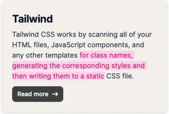
For a nice twist for your users, you can modify the active text selection. This is nice, especially if you provide content that is copied often, however you might not want to go too crazy with this one.
Tailwind lets you modify the active text selection with the selection modifier:

<div className=" … ">
  <h2 className=" … ">Tailwind</h2>
  <p className="… selection:bg-pink-200 selection:text-pink-600 …">
    Tailwind CSS works by scanning all of your HTML files, JavaScript components,
    and any other templates for class names, generating the corresponding styles
    and then writing them to a static CSS file.
  </p>
  <a href="#" className=" … ">
    Read more
    <svg>
      {…}
    </svg>
  </a>
</div>
Remember to take care of appropriate color contrast!
Style Based on the Parent Element
Styling elements based on the parent elements state is also very handy. Tailwind lets mark the elements with group class and use group-* modifiers like group-hover to style the child elements.
Let’s revise our example code that we have been using here. Say we wanted to style the Read more text with underline on hover, but we would like the underline to appear on the button hover rather than hovering the actual <a> element.
To achieve this, we must add the group class to the <a> element and introduce a <span> element with group-hover:max-w-full etc. classes to help us achieve the underline effect. You could also do this same effect without using the group class and <span> element, but I just wanted to show with these (roast me).
<a href="#" className="… group …">
  Read more
  <span className="absolute left-3 right-3 bottom-2 z-10 max-w-0 group-hover:max-w-full transition-all duration-500 h-[2px] bg-white "></span>
  <svg>
    {…}
  </svg>
</a>
The <span> element has a group-hover modifier which shows that, when hovering over the element with the group class, apply certain styles. It is also possible to style based on sibling state using the peer class.
Style Based on Children
In the case you needed to style a parent element based on the state or elements of its descendants, you can use the has-* modifier.
There are many places where this could come in handy. Suppose you wanted to color the form’s border red when there are invalid input fields, like this:

This effect can be achieved using the has-[input:invalid]:border-red-500 class, which just checks if there is a descendant input element with the class invalid.
<div className='… … has-[input:invalid]:border-red-500'>
  <form className='space-y-6' action='#'>
    <h1 className='text-xl font-medium'>Sign in</h1>
    <div>
      <label htmlFor='email' className='…'>
        Email
      </label>
      <input
        type='email'
        name='email'
        id='email'
        className='… … invalid:border-red-500 invalid:text-red-500'
        placeholder='name@company.com'
        required
      />
    </div>
    <div>
      <label htmlFor='password' className='…'>
        Password
      </label>
      <input
        type='password'
        name='password'
        id='password'
        placeholder='••••••••'
        className='… … invalid:border-red-500 invalid:text-red-500'
        required
      />
    </div>
    <div className='…'>
      <a href='#' className='…'>
        Lost Password?
      </a>
    </div>
    <button type='submit' className='…'>
      Login to your account
    </button>
    <div className='…'>
      Not registered?{' '}
      <a href='#' className='…'>
        Create account
      </a>
    </div>
  </form>
</div>
Conclusion
Hopefully, you find these tips helpful and will introduce these into your Tailwind workflow. I know that there are a lot of great features, maybe even more important than the ones I listed here, however these was the most helpful ones I have yet to discover (not counting in the most obvious Tailwind features, like media queries, dark mode etc.).
See you in the next one!