Are Tailwind Container Queries Supreme?
- html
- tailwind
- tutorials
Container queries enable to apply styles based on the size of the elements container. When creating responsive web pages, we usually use the media queries to achieve seamless design across devices. However media queries might come short in some places and this is why container queries are a thing.
In Tailwind, creating responsive designs with the media queries is part of the core concepts. Everyone is familiar with the responsive design syntax of using breakpoint prefixes for various screen widths: sm, md, lg, xl, 2xl.
Getting Started
You can install the official Tailwind container queries plugin following these instructions on the GitHub page.
Usage
The plugin introduces a new syntax for these containers @container. When you apply the classname @container into an element, Tailwind will mark it to allow querying the elements’ size from the descendant elements.
<div className='@container'>
  <p className='@sm:text-blue-500 @md:text-black'>Simple Div</p>
</div>
This will create the <div> element and the element is now marked as a container in the DOM:

The @container will produce the element to have the following CSS.
{
  container-type: inline-size;
}
In the example, we see we are querying the <div> elements size using the @sm and @md breakpoint prefixes, just like we would query for a screen size using the media query prefixes.
Now although a little hard to see, when the <div> has the min-width: 24rem /* 384px */, the text will be blue:

And for a min-width: 28rem /* 448px */ the text will be black:

These are simple examples only to showcase the whole idea for now. We will cover a more advanced problem later.
Naming the Containers
It is also possible to distinguish the containers by giving names to them:
<div className='@container/simple-div'>
  <p className='@sm/simple-div:text-blue-500 @md/simple-div:text-black'>
    Simple Div
  </p>
</div>
Container Sizes
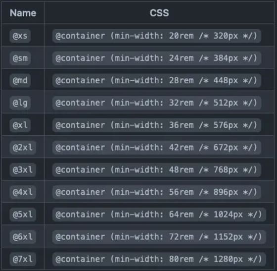
By default, Tailwind ships the following sizing for the containers:

It is also possible to provide arbitrary container sizes:
<div className='@container'>
  <p className='@[250px]:text-blue-500 @[500px]:text-black'>Simple Div</p>
</div>
Solving Real Problems with the Container Queries
All right, enough non-sense. Let’s see if we can solve anything real with the container queries. Imagine you have a blog or whatever where you want to display max three featured posts at the end of an article.
So far you have worked on the problem and come up with the following code for the articles.
<li className='col-auto w-full max-w-[450px] rounded-lg border border-gray-200 bg-white shadow md:md:max-w-full md:text-left md:first:col-span-2 lg:first:col-span-1'>
  <img
    className='h-[200px] w-full rounded-t-lg object-cover'
    src={imgSrc}
    alt=''
  />
  <div className='px-4 py-2 md:p-5'>
    <a
      href={url}
      className='cursor-pointer text-2xl font-semibold text-gray-700 underline hover:text-blue-500'
    >
      {title}
    </a>
    <p className='my-4 font-normal text-gray-700 dark:text-gray-400'>
      {excerpt}
    </p>
  </div>
</li>
Which are rendered in an unordered list element:
<ul className="gap-4 max-w-[1200px] justify-items-center mx-auto grid grid-cols-1 md:grid-cols-2 lg:grid-cols-3">
  {…}
</ul>
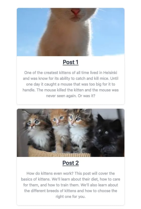
This code will result in the following: for a small device like mobile devices, the articles are displayed in one column.

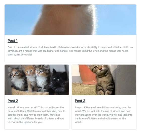
Nothing special here, moving on to the medium device width where the most “relevant” article i.e. the first result from your database is “highlighted”, as you have created a brilliant backend service that returns the featured posts ordered by relevancy.

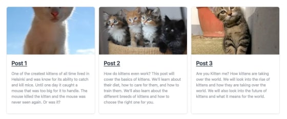
Here we see a little problem with how that most relevant featured article will have the same styling as the other ones. We would like to display image and text side-by-side, image on the left in a square and the textual contents on the right-side. Moving on to the larger screens, where the featured articles are displayed in their own columns.

This one is also good as it is. So how could we get the features article to be displayed differently?
Time to Rethink
How could we create this kind of functionality? Hmmmm. Oh yeah, container queries! Let’s think this through.
If we were to apply the @container into the <li> elements, we could query the <li> elements width rather than the screen width. This sound like something that would solve our problems, doesn’t it?
We know that the breakpoint for md media query is 768 px, so we probably want to query less than that for that width also on the container. After careful inspection we’ve found that around 700 px is a good point to change the style.
Let’s also change the unordered list to take its columns based on the width of the element. For this, let’s wrap our <ul> element in a <div> element and give it a **_@container/grid_** classname.
<div className="@container/grid">
  <ul className="grid gap-4 max-w-[1200px] justify-items-center mx-auto @[700px]/grid:grid-cols-2 @[1024px]/grid:grid-cols-3">
    {…}
  </ul>
</div>
We’re now querying the container named grid for its width and, based on the width, we are defining our grid columns in the <ul> element. Now moving on to the article element.
<li className='@container/article @[700px]/grid:first:col-span-2 @[1024px]/grid:first:col-span-1 w-full rounded-lg border border-gray-200 bg-white shadow md:text-left'>
  <div className='@[700px]/article:flex-row flex flex-col'>
    <img
      className='@[700px]/article:rounded-t-none @[700px]/article:rounded-l-lg @[700px]/article:h-[300px] h-[200px] w-full rounded-t-lg object-cover'
      src={imgSrc}
      alt=''
    />
    <div className='px-4 py-2 md:p-5'>
      <a
        href={url}
        className='cursor-pointer text-2xl font-semibold text-gray-700 underline hover:text-blue-500'
      >
        {title}
      </a>
      <p className='my-4 font-normal text-gray-700 dark:text-gray-400'>
        {excerpt}
      </p>
    </div>
  </div>
</li>
We’ve changed the <li> to also a container named article. In the <li> element, we are querying the grid container’s width also to span the featured article on to two columns. Inside the <li> element, we’ve added a new <div> element, which is just a flexbox for our desired layout change. Based on the article element’s width, we define whether the element should be displayed in the image and text side-by-side or stacked.
This new design results in the following behavior:
And that’s it! I do not say that the following demonstration couldn’t be done any other way, no I think there are several other ways to achieve that functionality. However, it was more on the easier but realistic sides of examples I could think of.
Conclusion
Container queries come in handy when implementing something that would require custom components and media queries. They give us more control over the responsiveness of a layout.
I do not think that container queries will replace media queries because media queries can do a lot more than just query for the screen width.