Start Creating Accessible Navbars in Next.js 14
- accessibility
- react
- tutorials
Coming from using React, Vite, Node, Express, etc. I wanted to try something new and buzzwordy. Next.js.
So, wanting to dive into the Next.js, I thought what’s better than to learn by the simple stuff, creating the navigation bar.
I was skimming through some Next.js navbar tutorials. This way, I can get the feel for a new framework. Thought it did not last long. I wanted to provide an accessible design for my navbar, but the tutorials all were using divs pretty much.
Don’t get me wrong, divs have their time and place – but let’s talk about taking things up a notch and creating navbars that are not just functional but also accessible.
Semantic HTML
While not giving you a full semantic html lecture here. I wrote an article about the importance of semantic html. I suggest reading the article. It will get you going and help to understand the benefits. For a quick recap, these are special html elements that have their designated purpose. One of these is the nav element. This is just what we are looking for when we want to create navbars the right way.
The power of <nav> element
The <nav> element provides a section for navigational links. What makes it better than using plain <div>, it has the navigation aria-role by default. This aids screen reader users by identifying sections of the web page.
Creating Accessible Navbar
We will not be covering how to style your navbar and how to make it responsive. I will provide some basic Tailwind styles; however, the article will not focus on this.
Assuming you have the basic Next.js project setup, if not, setup your Next.js project.
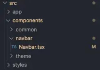
Let’s start by creating a new directory for the components. On the same directory level, the /app directory is located, create new directory /components. Inside this directory you will have all your React components.
It’s up to you how you organize your files inside the component directory. I like to create a subdirectory for specific functionality. Create a file for the navbar functionality Navbar.tsx. If you are not using TypeScript, use .jsx instead. This guide will continue using TypeScript, and I will not provide the differences.

Inside the Navbar.tsx component paste the following code:
import Link from 'next/link'

const Navbar = () => {
  const NAV_ITEMS = [
    {
      name: 'Home',
      href: '/',
    },
    {
      name: 'About',
      href: '/about',
    },
    {
      name: 'Tutorial',
      href: '/tutorial',
    },
  ]

  return (
    <nav
      id='primary-nav'
      aria-label='Primary'
      className='max-w-8xl mx-auto flex items-center justify-between px-12 py-4 lg:py-8'
    >
      <ul className='flex'>
        {NAV_ITEMS.map((item) => (
          <li key={item.name} className='px-5 py-2'>
            <Link href={item.href}>{item.name}</Link>
          </li>
        ))}
      </ul>
    </nav>
  )
}

export default Navbar
We have defined an array of navbar items, this is a standard method and not that interesting. Adjust the items according to your needs. Let’s focus on the <nav> element and what we got going on there.
We have introduced the aria-label attribute, and set its value to “Primary”. This will distinguish the navigation elements from each other if the page would have multiple <nav> elements. This will be read to screen reader users, and they will know which is which. If you are sure that you are not introducing other <nav> elements, you can omit this attribute.
The rest is straightforward. The different NAV_ITEMS are rendered into an unordered list and each link uses the next/link. Next links are rendered as <a> elements and are accessible by default.
Creating Accessible Navbar
While it might be tempting to add the logo and other non-navigational elements into the nav, I would not. Keeping the <nav> solely for navigational elements, we must introduce an additional element. The header element. We will get back to the <header> element in a moment.
A Way to Skip Navigational Elements
Suppose we wanted to add a skip link. This is a kind of navigational element, but its only purpose is to provide a way to skip navigational links for screen reader users.
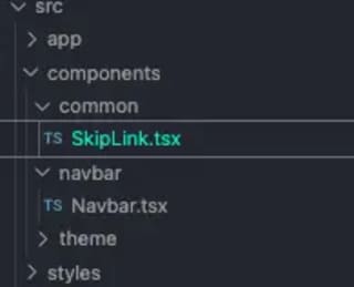
Let’s modify our navbar to provide a way for our screen reader users to skip the navigational links. We will have to create a new component, SkipLink. I have created the SkipLink.tsx file into a new component directory /common.

Inside the SkipLink.tsx component paste the following code:
import Link from "next/link";

interface SkipLinkProps {
  href: string;
}

const SkipLink = ({href}: SkipLinkProps) => (
  <Link href={href} className="sr-only">
    Skip to content
  </Link>
);

export default SkipLink;
By creating the component into a /common directory and providing the href prop for the component, we assure the reusability from anywhere in our codebase. The href prop will be a bookmark id of the section that we want to skip to.
As the SkipLink is only meant for screen reader users, it does not even have to be visible. Adding the className “sr-only” we can hide the component as Tailwind has built-in utility class for this.
This way the link is not visible to the normal user, however it is still in the DOM and screen readers can read it.
Moving on to adding the new component into our navbar, I don’t think that it should be inside the <nav>. This is where the <header> element comes in handy.
Let’s update our Navbar.tsx by wrapping the <nav> inside the <header>.
<header
  role='banner'
  className='max-w-8xl mx-auto flex items-center justify-between px-12 py-4 lg:py-8'
>
  <SkipLink href='#main' />

  <nav id='primary-nav' aria-label='Primary' className='hidden lg:block'>
    <ul className='flex'>
      {NAV_ITEMS.map((item) => (
        <li key={item.name} className='px-5 py-2'>
          <Link href={item.href}>{item.name}</Link>
        </li>
      ))}
    </ul>
  </nav>
</header>
By defining the aria-role banner we have stated that the following section is a global site header. In fact, the aria-role attribute could be omitted in our example because the <header> is not a descendant of <aside>, <article>, <main>, <nav>, or <section>.
The <header> allows us to introduce other components for the Navbar component without wrapping them directly inside our <nav>. For example, I want to add site logo and a dark mode toggle to the Navbar, but they are not navigational elements.
Updating Navbar.tsx further:
<header
  role='banner'
  className='max-w-8xl mx-auto flex items-center justify-between px-12 py-4 lg:py-8'
>
  <SkipLink href='#main' />

  <div id='logo' className='flex justify-center gap-4 align-middle'>
    <p className='block whitespace-nowrap text-3xl font-semibold transition focus:outline-none'>
      Swift Contrast
    </p>
  </div>

  <nav id='primary-nav' aria-label='Primary' className='hidden lg:block'>
    <ul className='flex'>
      {NAV_ITEMS.map((item) => (
        <li key={item.name} className='px-5 py-2'>
          <Link href={item.href}>{item.name}</Link>
        </li>
      ))}
    </ul>
  </nav>

  <div className='flex items-center justify-center'>
    <DarkModeToggle />
  </div>
</header>
Users can now navigate our navbar easily with a screen reader or keyboard and optionally skip to the main content of the web page.
Integrating the Navbar
To integrate our Navbar component into the root layout, we must update the /app/layout.tsx file.
export default function RootLayout({
  children,
}: {
  children: React.ReactNode;
}) {
  return (
    <htmllang="en">
      <body className={inter.className}>
 <Navbar />
        <main id="main" className="min-h-screen p-24">
          {children}
        </main>
      </body>
    </html>
  );
}
By defining our <main> element with the id=“main” we can navigate to the part of the web page using links. Like in our SkipLink component.